Monday, 25 August 2025
MacOS has shipped with a collection of “utility” apps since the prehistoric era of classic Mac OS. A good rule of thumb what makes an app a “utility” is that it’s a tool for doing something about your computer. Ever since Mac OS X 10.0, most of these apps have been neatly filed away in /Applications/Utilities/. Others — some because they’re obscure (e.g. Ticket Viewer), some because they’re effectively deprecated (e.g. DVD Player, whose copyright date in MacOS 15 Sequoia is 2019), and some because they present themselves, when launched, not as apps but as system-level features (e.g. About This Mac) — are tucked away in /System/Library/CoreServices/ or /System/Library/CoreServices/Applications/.
Basic Apple Guy posted a screenshot to Mastodon comparing the current MacOS 15 icons for four of these utilities (Disk Utility, Expansion Slot Utility, Wireless Diagnostics, and AppleScript Utility) to their new icons in MacOS 26 Tahoe, beta 7 (click to enlarge for detail):
I don’t think the old icons for these apps from MacOS 15 were particularly good — Apple has mostly lost its “icons look cool” game. But the new ones in MacOS 26 Tahoe are objectively terrible. The only one of this bunch that’s maybe sort of OK is Wireless Diagnostics. They all look like placeholder icons made by a developer who would be the first to admit that they’re not an artist. Disk Utility, which is an important app, doesn’t even look like it involves a disk. That icon just says “Fix something Apple related.” On an Apple computer, that could mean anything.
These new icons all use the same “wrench” motif, which is a lazy, limiting concept to start with. Tahoe, at the system level, enforces a squircle shape on all application icons. Apps that haven’t been updated with Tahoe-compliant everything-fits-in-a-squircle icons are put in “squircle jail” — their non-Tahoe-compliant icons are shrunk and placed atop a drab gray Tahoe squircle background, to force them into squircle compliance. But these Apple utility apps have an entire sub-motif — inside their base squircle shape is a large wrench fitted against a bolt. Only inside the bolt — which is inside the wrench’s forks, which wrench is inside the squircle — goes the part of the icon that identifies app itself. So maybe like 10 percent of the area of the icon is the area where the app can show something that identifies its purpose.
So the entire concept for these icons sucks. But the conceptual execution sucks too. The wrench is incredibly stupid-looking. Whoever drew it has obviously never used a crescent wrench because the forks on the wrench head are way too thin. They’d break off under any significant torque. Just look at a photo of real-life wrench, or — just look at the wrenches in the older MacOS icons.
Individually the icons mostly suck too:
-
Disk Utility — a very important app — has an icon that’s just an Apple logo (inside the bolt that’s inside the wrench that’s inside the squircle). Not a hard drive, not an external drive, not an SD card. Just an Apple logo. If I just showed you this icon without telling you which app it represented, how in the world would you guess what it is? Even if you know the “Apple utility app icon” motif of the big dumb wrench and bolt, the best you could guess is “a utility app for something Apple-related” which, for an Apple computer, could be anything.
-
Expansion Slot Utility — This app only runs on Mac Pros because Mac Pros are the only Macs with expansion slots. So the old icon naturally shows a Mac Pro. The new icon shows … three rectangular empty sockets?
-
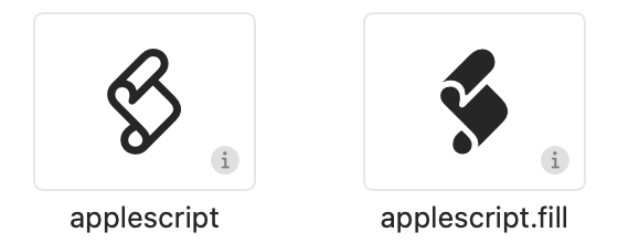
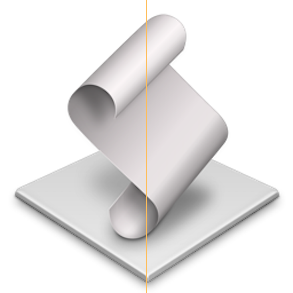
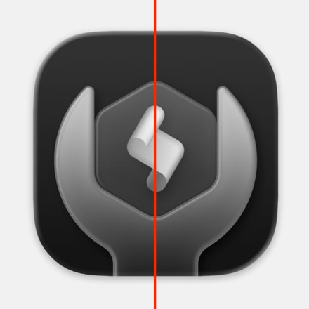
AppleScript Utility — A fine concept for this icon (within the confines of the terrible wrench-and-bolt utility icon concept). Everyone who knows AppleScript knows the scroll that represents AppleScript scripts. So just put the iconic AppleScript scroll in the bolt in the wrench in the squircle. But here, the placement of the scroll is botched — it’s rotated a few degrees counterclockwise. It makes the scroll look like it’s falling over. Here’s how the scroll is canonically oriented, via the glyphs in SF Symbols:

and via the default icon for a script application (with a line added showing the center):

But here’s a close-up of the Tahoe AppleScript Utility icon, with a center line added:

It’s wrong. From Apple, of all companies.
These are the not the work of carpenters who care about the backs of the cabinets they’re building. These icons are so bad, they look like the work of untrained “How hard can it be?” dilettante carpenters who only last a few days on the job before sawing off one of their own fingers. The whole collection looks like the work from someone with no artistic ability nor an eye for detail. From Apple, of all companies.
Is it a big deal in the grand scheme of things that the icons for these seldom-used utility apps have gone to shit? No. But consider the proverbial canary in a coal mine. The problem isn’t that one little bird has died. The problem is that the bird might be dead because the whole mine is filling with deadly carbon monoxide or highly flammable methane gas. The icons in /Applications/Utilities/ in MacOS 26 Tahoe represent a folder full of dead canaries.


