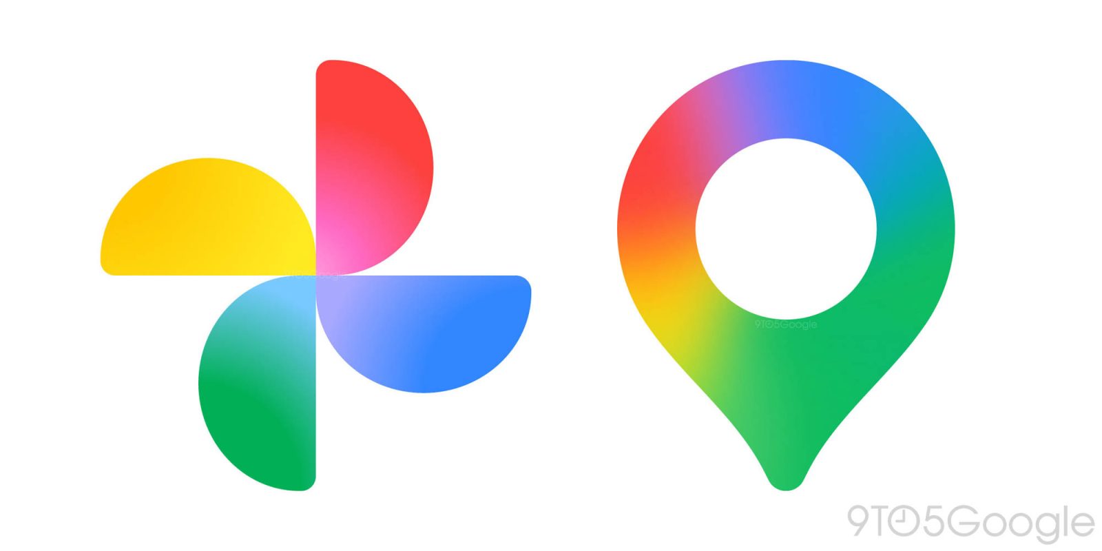
Following the ‘G’ and Gemini icons, Google is updating its logos for the AI era. Here’s a sneak peek at the new gradient icons for Google Photos and Maps.
In May, the Google (Search) app got a new icon that got rid of the four solid color sections for a gradient. This came to the Gemini spark a month later.
This September, Google finally detailed its thinking behind the gradient icon redesigns: “While staying true to Google’s iconic four colors, the brighter hues and gradient design symbolize the surge of AI-driven innovation and creative energy across our products and technology.”
The gradient G also expanded beyond Search to represent “all of Google” (the brand and company). Additionally, the company said how it will “continue this update across more products, platforms and services over the coming months.”
Google Maps and Photos are up next, with a source sharing the redesigned gradient icons with us today.
Old vs. new


The new Google Maps icon is still a pin, but the shape has been modernized and is thinner. The inner circle is significantly larger, with Google getting rid of the diagonal partitions, which had two shades of blue. This reflects how Gemini is available in place listings.
Meanwhile, the Google Photos icon keeps the same shape, with the gradient effect radiating from inside out. When blown up, the inner portion looks transparent, but it should be fine as a small app icon on your homescreen. Google Photos offers Remix, photo-to-video (Veo) generations, and conversational editing, as well as the Gemini-powered Ask Photos. Nano Banana is also coming to Google Photos.


It’s unclear when these new icons are launching, but it could be at any time given the existing presence of AI features.
FTC: We use income earning auto affiliate links. More.


