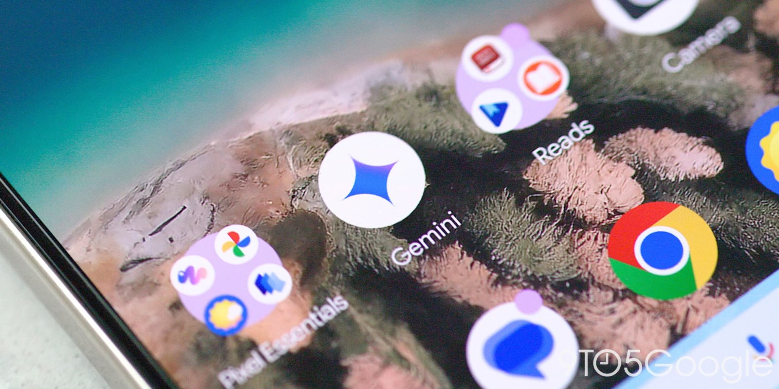
Since launch, Gemini has had its own distinct blue-purple color palette. Google is now ready to more closely align the Gemini app to the primary brand with a new icon.
Back in April, Google updated the logo on Android and iOS to tweak the blue-purple distribution. It was a minor change that made the homescreen icon a little bit bigger and brighter.
In retiring Gemini Advanced (for AI Pro) last month, Google started phasing out the red variant of the logo (as seen below) for subscribers to make clear that’s just one Gemini.
Old vs. new


We’re now seeing a new logo when we generate Audio Overviews. The four-pointed sparkle shape is unchanged, but the icon makes use of four colors. Blue is the predominant hue at the right, while the other points are red, yellow, and green. There’s also a gradient effect at the left side.
It feels right at home with the updated ‘G’ logo introduced a few weeks ago.
We’re just seeing this new Gemini icon in one place on Android with beta version 16.25 of the Google app. It’s not live anywhere else on mobile or desktop, but this looks like a solid indication of what to expect.

9to5Google’s Take
This move to make Gemini look like every other Google app reflects a confidence in the chatbot. That has been the case for a while now, but this branding change makes things a bit more official.
That said, the perennial complaint is that all Google app icons look the same. Color is no longer a way to distinguish the Gemini app on your homescreen, though most probably launch it by long-pressing the power button or swiping from the corners. I think the shape is enough to let the Gemini logo standout, but I liked the blue/purple for giving Google a second color scheme to work with and distinguishing the AI aspects of an app.
More on Gemini:
FTC: We use income earning auto affiliate links. More.


