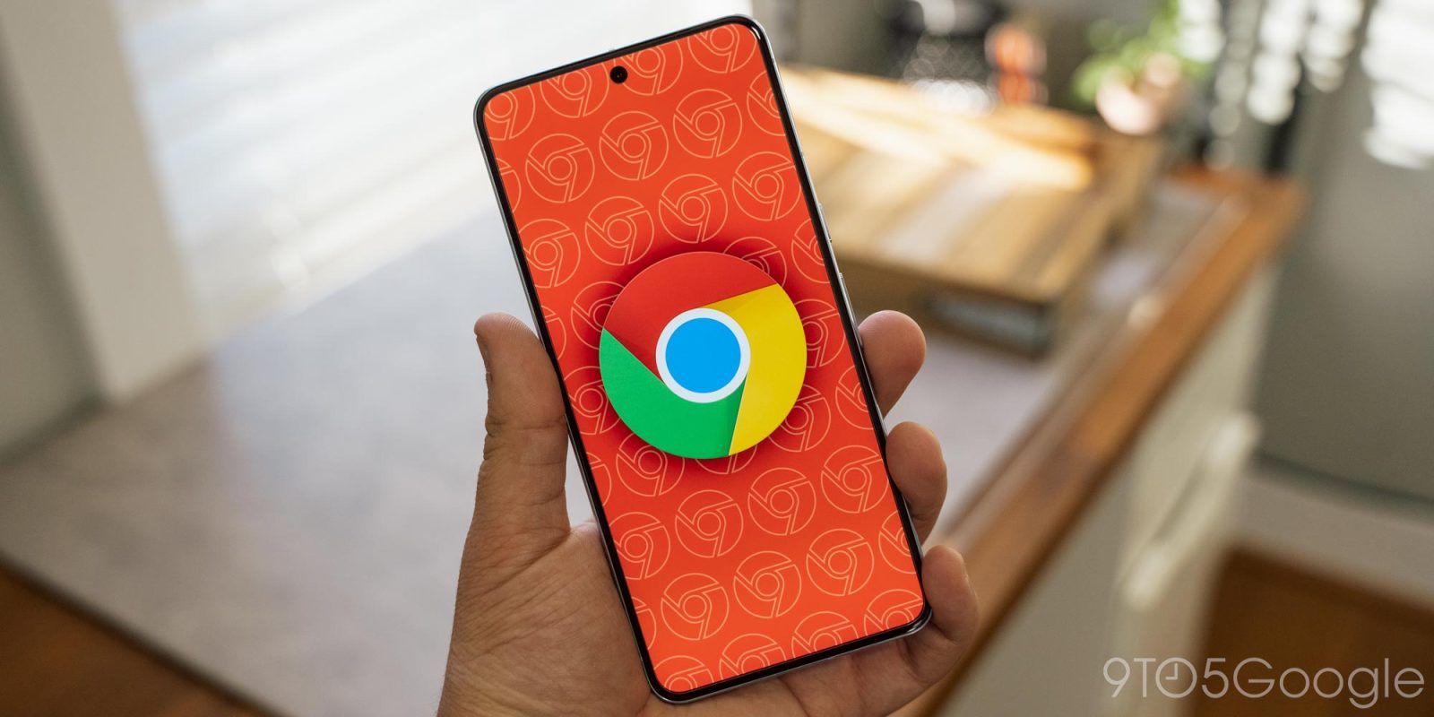
The Google Chrome interface has remained remarkably consistent over the years, and the Android browser is now getting Material 3 Expressive tweaks to match other first-party apps.
The primary browsing interface that is the Omnibox remains the same except for the loading indicator. Chrome is taking advantage of the split/segmented progress indicator component with rounded “corners.”

You see more Material 3 Expressive upon opening the three-dot overflow menu. Chrome has placed the go forward, bookmark star, download, site info, and refresh buttons at the top in circular containers. This does help those actions stand out a great deal more against the ever-growing list of options.
On the Tab Grid page, the new tab ‘plus’ has been placed in a rounded square, while the tab, Incognito, and Groups switcher is also placed in a container.
Update: An unselected Tab Group’s theming (the frame) is based on the color you’ve selected.


Over the years, Chrome has been visually refreshed to align with the company’s various design updates. As seen with this Material 3 Expressive, they rarely change the browser’s interface in significant ways.
If anything, the design language is made to fit within Chrome’s established interface. In placing various components in containers today, buttons don’t see any size increases. (The small new tab button looks strange.) List views, including Settings, do not see any changes.
We’re seeing the Material 3 Expressive tweaks with Chrome 139 on the Pixel 10, as well as Android 16 QPR2 Beta 1. The refresh is not fully available yet, with this rollout unexpectedly happening over the weekend.
More on Material 3 Expressive:
Thanks Armaan
FTC: We use income earning auto affiliate links. More.
![]()