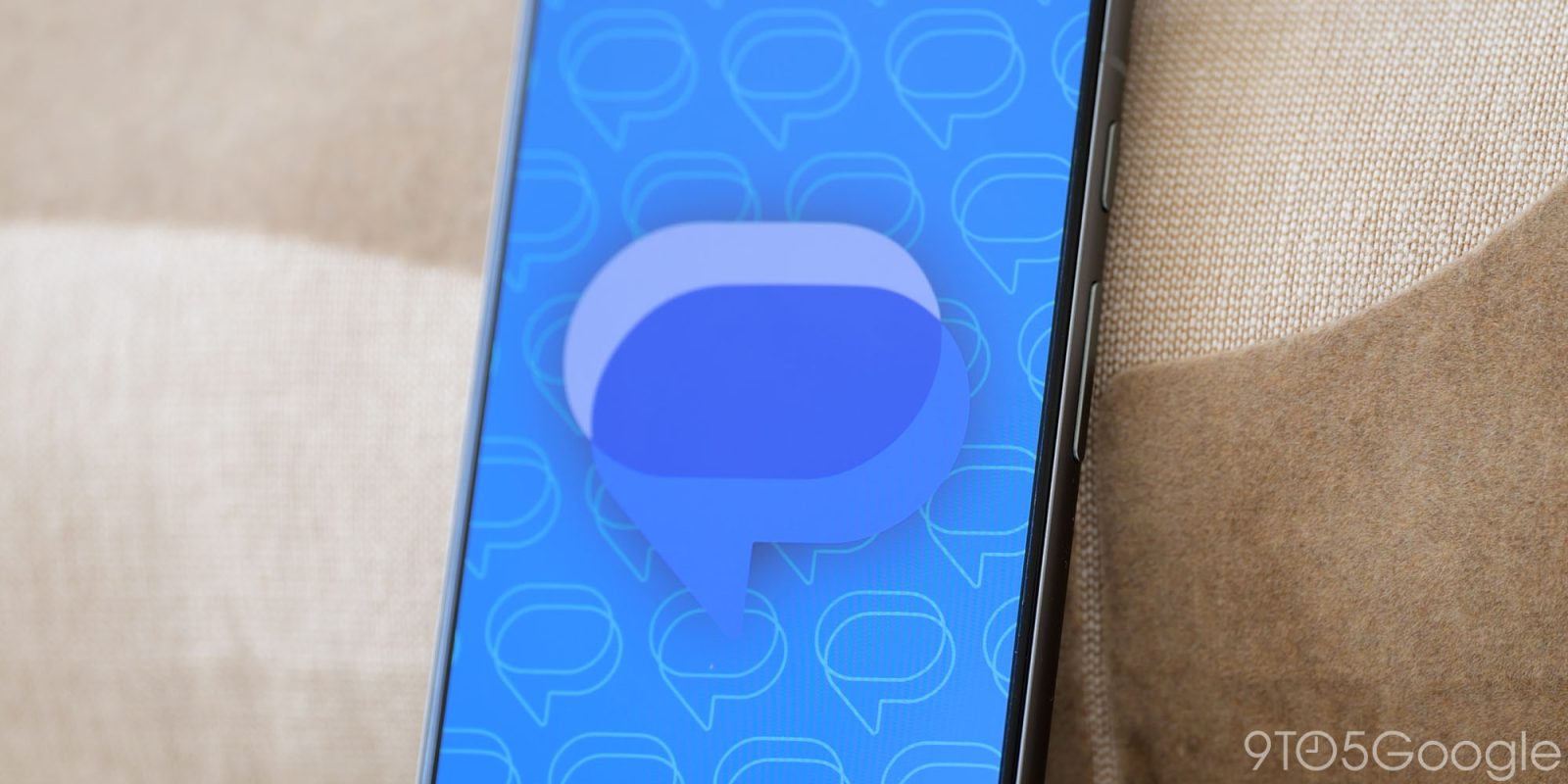
The Google Messages redesign started widely rolling out to the stable channel last week, and Material 3 Expressive is now available on the actual chat screen.
Like on the homepage, the message thread is now placed in a container with curved corners at the top. That background layer features the app bar with phone/video calling shortcuts, and the overflow menu. The bubbly wallpaper has been replaced by a solid color when using both light and dark themes.


There is another container when you open the ‘plus’ menu in the text field. The Gallery, Camera (not yet launched), GIFs, Stickers, Magic Compose, Files, Location, Contacts, Schedule Send, and Selfie GIF buttons are no longer in colorful circles. You instead get pill-shaped containers and a more spacious grid.
Old vs. new


Meanwhile, the expressive media picker also gets Material 3 Expressive with a button group at the top that morphs based on what’s selected. The search bar has been moved down so you don’t have back-to-back text fields, while there’s slightly less emphasis on Photomoji.
This wide chat rollout should bring this piecemeal Google Messages redesign to a close and follows the Contacts and Phone apps in recent weeks.

More on Google Messages:
FTC: We use income earning auto affiliate links. More.
![]()